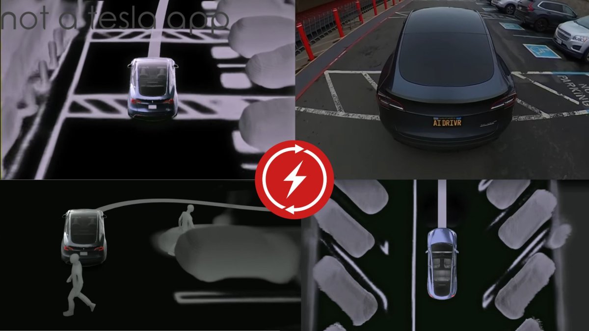
Discuss: Tesla Brings New Autopark and High Fidelity Park Assist to Vehicles with Ultrasonic Sensors [Video]

Not a Tesla App

Administrator
Staff member
Aug 18, 2022
1,612
263
83
  • Like
Reactions: RNHurt

EVSteveA

Active member
Jan 19, 2023
145
49
28
The shambles continues if you are outside of the US, Tesla takes your money and fails to deliver even when new Autopark is available. I think it’s time to bring a law suit
 
  • Like
Reactions: K.I.T.T.

PrescottAZRichard

Well-known member
Oct 28, 2022
488
310
63
Interesting point at the end of the video- why would having USS make it more difficult to implement on those cars? Perhaps there’s something else there hardware-wise that was upgraded post USS? Sounds like the older Intel cars are still waiting for auto park? I’m watching some 12.3.6 videos looking to see if the hugging the right side of the lane is fixed. I went up a twisty road last wednesday and used 12.3.5. It did great for the most part but there were two times that I was uncomfortable with how close or over the line I was on the right side of the car with some of the twists.
 
  • Like
Reactions: RNHurt

K.I.T.T.

Active member
Mar 26, 2024
280
200
43
Italy
That's true genius. So, my previous M3 had USS. Obviously, the current Highland hasn't. Are they looking at selling USS as factory retrofit now?

The whole concept behind Vision is flawed: that's precisely why you need USS/Radar/Lidar to overcome the limitations of sight, that's why aircraft fly with all sorts of navigational radio aids. You can't rely on a camera in pouring rain on a highway, but your eyes and experience can "see" the path and avoid obstacles, aided by the radar. You rely only on Tesla Vision, you're "grounded" for VFR only (Visual Flight Rules), aeronautically speaking. Of course, USS alone won't give AI the map of surroundings, that's when Vision comes into play.

We need the best of both worlds. Vision and USS/Radar/Lidar combined.
 
Last edited:

Sonny1983

New member
Apr 30, 2024
9
10
3
Yeah. Also never understood why they produce a car with tons of exquisite and expensive features, but decided to skip on cheap of-the-shelf tech like USS. Nearly all cheap small cars all have at least USS today.
 
  • Like
Reactions: K.I.T.T.

K.I.T.T.

Active member
Mar 26, 2024
280
200
43
Italy
Exactly, nonsense. But then they removed even the stalks, so - hey - there's the legendary tale of American Airlines saving gazillions by removing 2 olives from the on-board "complimentary" menu. If they could, they'd remove steering wheel, pedals and driver - oh that's actually their ultimate goal.
 

Sonny1983

New member
Apr 30, 2024
9
10
3
Purely from aesthetics, I like the removal of the stalks. But when you weigh the usability handicap against optics, it's not the right move. I don't think swiping on a screen is easier when parking back and forth. Turn signals: Ok to use buttons on normal roads, but what inside roundabouts (hope this is the right term)? In Germany we have a lot of small roundabouts where you have to turn the steering wheel a good 90° or more. I don't think its that easy to press the right turn signal button before you exit. So I'm happy my M3 still has stalks. It still looks incredibly clean and sleek from the inside. No need to take them away.

And as much as I love Tesla, IMHO their (or Elons) vision of nearly 100% autonomous driving in the future is flawed. Yes, for taxis it might be ok. As a driving assistent, too (the current software does it not too bad). But I think a lot of car lovers want to drive themselves. Making a car where the driver is only a passenger reduces the car to only being a blunt tool to get from a to b. There is no more passion about it. And for just a tool, I would not spend that much money.
 

K.I.T.T.

Active member
Mar 26, 2024
280
200
43
Italy
I already commented on this: if they wanted to embark on such a bold move, they should have thought it out better. They used the same approach they would adopt on a software UI, only the steering wheel is hardware... a "real" recall is only a matter of when this time. It's not about "aids" as USS, this is safety.
  • arrows are stacked, because they mimic the movement we were doing with the stalks, that is fine. But what about the flashing button? It's on the right of the right arrow button and not separated by a physical touch barrier, as opposed to the left arrow button. I wonder how many cars were "flashed at" just by turning right or switching lanes. The problem lies with the flashing button, it should have been put on the lower row (more or less where the still-disabled "autopilot" button is on the right side) and more accessible to thumbs of less-than-Jimi-Hendrix sized hands.
  • there should be less distance between buttons and more physical boundaries, so you don't have to look at it at all times
  • I don't really mind the decision to rely on the touchscreen, and the 2024.14 release should make it better (currently the dedicated UI portion is exceedingly high) but parking can be quite a nightmare, and I already managed to go the opposite direction that I wanted, twice (luckily without damage). An option to reverse the buttons should be given, for two reasons:
    • it would mimic the movement of the removed stalk, exactly as they thought it out for the direction arrows (consistency is a key point of UX design)
    • it's a standard, and if you want to break the standard you should at least give two options: those who rely on the standard will have their way, new drivers will adjust to the new standard more easily (there are user profiles, so as long as it's evident which mode is engaged, there would be no problem)
  • we should have the option of have the top PRND buttons (or, better, R and D only, due to the absence of physical boundaries) automatically back-lit at the same time the touchscreen interface gives the same choice, which could be only a software update apart, and it would have been nicer if they gave haptic feedback, including the emergency light button, since the absence of physical buttons
 

VoodooPriest

Member
Nov 26, 2022
40
44
18
I had to laugh the other day. When I got v12.3.6 on my 2022 M3LR with USS, I was eager to try the enhanced autopark. I went to the store, it did everything it was supposed to and nailed the spot on the first try. The next day, I drove into the office parking garage and tried it again it a deserted part of the garage. I kid you not, it backed up/realigned/moved forward/backed up/etc. no less than 9 times before it decided it was good. There were no other cars around. The lines were bright. The garage was well-lit. Like most everything Tesla, sometimes it's great, sometimes less than great.
 
  • Like
Reactions: RNHurt and K.I.T.T.

EVSteveA

Active member
Jan 19, 2023
145
49
28
I had to laugh the other day. When I got v12.3.6 on my 2022 M3LR with USS, I was eager to try the enhanced autopark. I went to the store, it did everything it was supposed to and nailed the spot on the first try. The next day, I drove into the office parking garage and tried it again it a deserted part of the garage. I kid you not, it backed up/realigned/moved forward/backed up/etc. no less than 9 times before it decided it was good. There were no other cars around. The lines were bright. The garage was well-lit. Like most everything Tesla, sometimes it's great, sometimes less than great.
Lucky you