First look at Tesla's new v11 UI
This year started with a firework show of cold weather improvements. However, Tesla is now completely redeeming themselves in this holiday update.
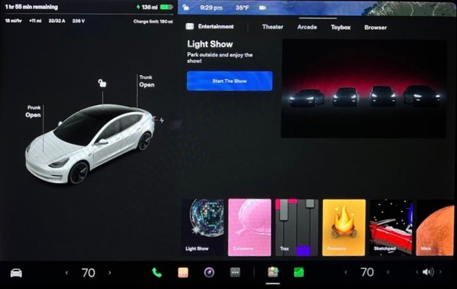
This year's holiday update is easily the most exciting update of the year. It's feature packed with some of the most requested features and improvements.
It includes an updated UI, a customizable app launcher, blind spot camera, TikTok, new games and so much more. Be sure to check out the release notes for the holiday update to see everything included in this update.
One of the biggest features in the holiday update isn't explicitly mentioned in the release notes.
V11 is Finally Here
The holiday update is officially v11, at least for Model 3 and Model Y owners. It's not clear yet whether pre-refresh Model S or Model X cars will get the updated UI as well.
Thanks to Reddit user Emulsifide, we now have a great look into everything that's included in v11. Let's dive in and find out everything we know about the new UI.
New UI
The Model 3 and Model Y UI has been updated with a fresh new look. It looks very similar to the UI on the redesigned Model S.
The update also brings over some of the UI functionality from the Model S.
Speedometer and Visualization
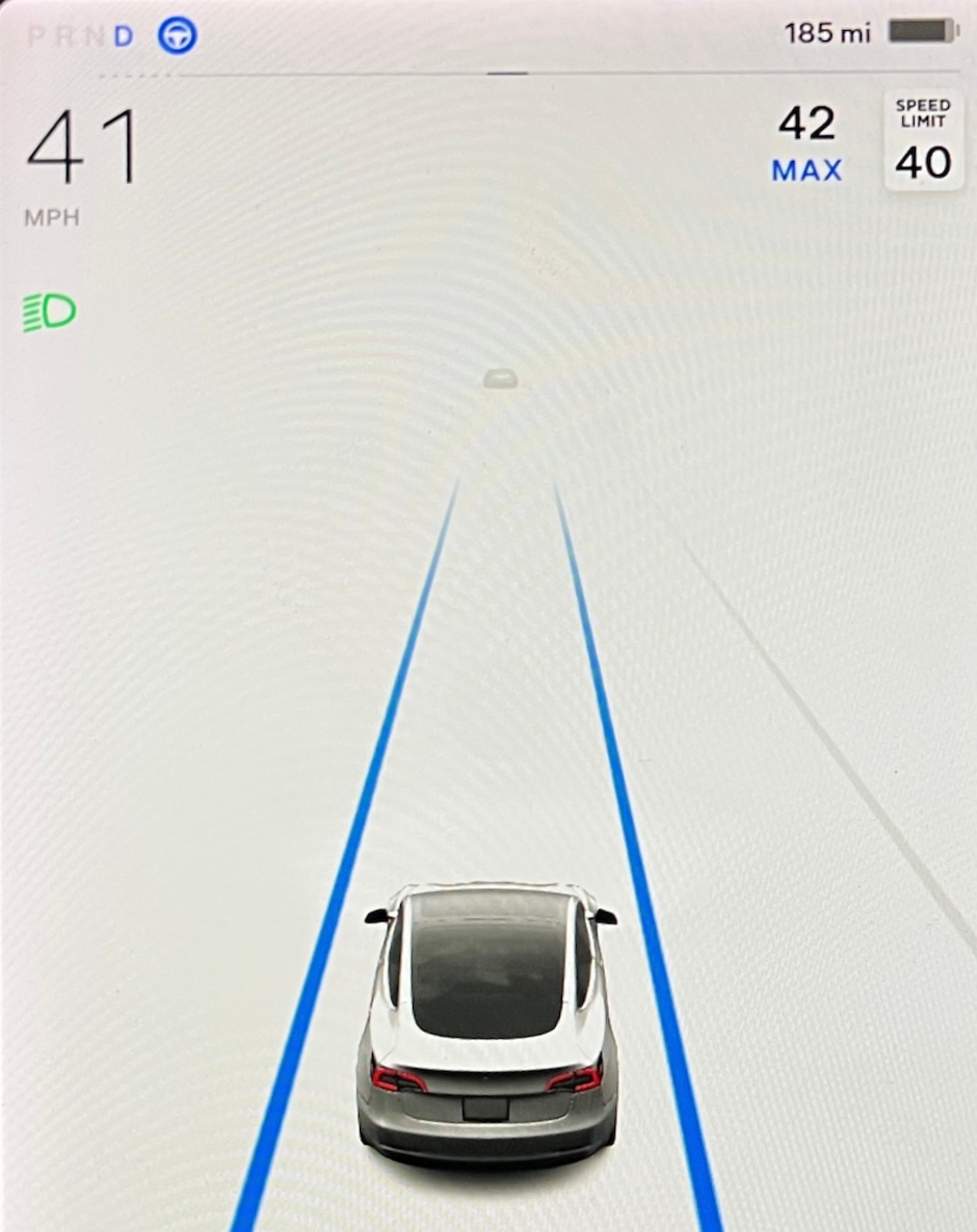
The speedometer and "instrument cluster" areas of the Model 3 have been redesigned.
The visualization area on the left is the same size as v10 and unfortunately, there's no way to resize it.
The information at the top left corner of the screen has been reorganized. The PRND status is now laid out horizontally instead of vertically, which allows the speedometer to be pushed all the way to the left. Its now slightly closer to the driver.

The accelration/braking line now goes almost edge to edge on the left side of the screen, instead of appearing between the PRND indicator and battery status.
Car status lights such as headlights and high beams are in a similar locations as before, but the speedometer is now directly above them instead of the PRND indicator.
Other icons that appear near the top of the screen have been moved around as well.
The Autopilot icon that used to appear underneath the acceleration/braking line has been moved up next to the gear selection.
In order for the Autopilot icon to visually fit in that area, it's now much smaller, having about the same height as gear letters themselves.
The speed limit sign is now smaller and remains aligned to the right of the visualizations panel.
The cruise control/max speed icon has updated from the classic blue circle to more closely match the US speed limit sign. Instead of having the set speed with a blue circle around it, it's simplified to just the set speed with the word "MAX" underneath. The cruise control speed icon is also aligned to the right now.
All of the icons have been pushed over to the edges, creating some empty unused space in the middle, which creates some additional height for the car visualizations.
With the increased height available for visualizations, details that are further away can now be displayed. The car visualizations themselves appear to be unchanged in this release.
App Launcher / Bottom Navigation
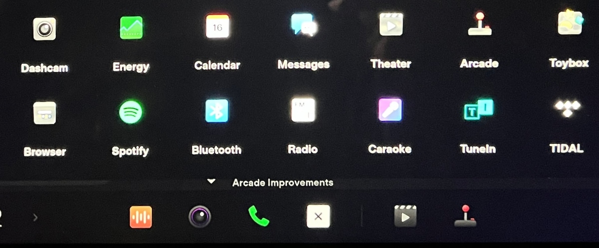
One of the most significant changes to the UI is the new look and available options in the car's bottom navigation.
The bottom navigaton, known as the app launcher, can now be customized.
It features three distinct areas, fixed apps that can not be moved or rearranged, customized apps and what appears to be recent apps, much like the Model S.
There is a predefined list of apps that can be placed in the app launcher. Apps that can be added to the launcher include:
- Dashcam
- Energy
- Calendar
- Messages
- Theater
- Arcade
- Toybox
- Browser
- Spotify
- Bluetooth
- Radio
- Caraoke
- Tune
- TIDAL
- Streaming
- Backup Camera
- Phone
To make room for customizable apps in the app launcher, many apps or features were removed.
For example, the wipers, seat heater and front and rear defrost options were removed from the launcher and can now be found in other locations.
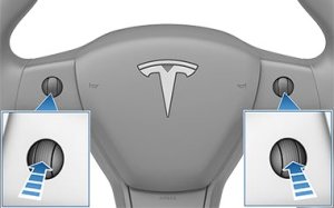
Wipers are now accessible through the left stalk button or by going to Controls, where you're then able to choose from off, low speed, medium, fast or auto options.
Seat heaters are now automatic and the temperature setting will be based on your set cabin temperature and the actual temperature inside of the vehicle. You can still set seat heaters manually by going into the HVAC options.
Unfortunately, the launcher options that were removed are not selectable as apps you can add back to the launcher.
New Icons
Version 11 now uses the same colorful app icons as the redesigned Model S.
Although most users prefer the modern monochrome look of the previous icons, I can see how these colorful icons may make apps easier to find at a glance.
My biggest issue with the new icons is that they appear out of place. They don't appear to go together as package, but this is subjective and some owners may be fans of their new look.
Top Status Bar
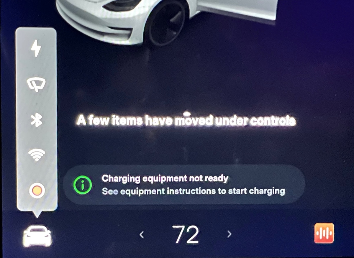
The icons in the status bar along the top of the screen has been reorganized. Normally, you'd find quick access to Wi-Fi, Bluetooth and LTE settings in this location, however these no longer appear under normal circumstances to provide a more streamlined look.
Other shortcuts in the top status bar such as Sentry Mode, Dashcam and Driver Profiles also aren't visible at all times.
Instead, these icons will only show up in the status bar whenever you're in Controls. When you're in any of the car's menus, you will then see all the familiar icons along the top of the screen.
Cards
The cards that you could swipe between on the visualization panel have been removed. Although some information will still appear in this area, you can no longer swipe to bring up the wipers, odometer, tire pressure or other items.
Most of these items have been relocated to be within the controls menu. For example, tire pressure now appears in Controls > Service.
Some alerts will continue to show up in the visualization area such as seat belt warnings and active call information.
Reorganized Menus
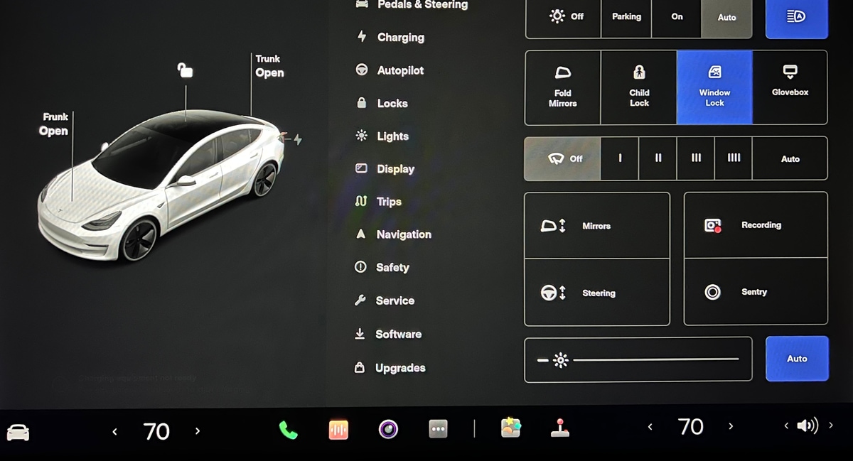
The control menus have been changed and reorganized to make them more consistent with the new Model S UI and to bring consistent between the Model 3/Y and the Model S/X.
Instead of odometer and trip information being a swipeable card, it can now be found by going to Controls > Trips, similar to the Model S and X.
Wiper settings are now under Controls as well and tire pressure is located under Service.
Some menu items have been renamed. Driving has been renamed to Pedals & Steering, while Safety & Security has been changed to just Safety.
Quick Controls is now just known as Controls, similar to the Model S.
The new Controls menu now includes buttons for features that can't be accessed anywhere else.
For example, Controls is now where you set your wiper speed, turn on Sentry Mode and Dashcam, open your glovebox and more.
The charging app was removed from the app launcher, so charge settings can now be found by going to Controls and then the new Charging menu.
The dedicated glovebox button that appeared at the bottom of all the menus has now also be moved to the Controls menu. Although it now appears within a menu, it is still still two taps to open the glovebox.
Blind Spot Camera
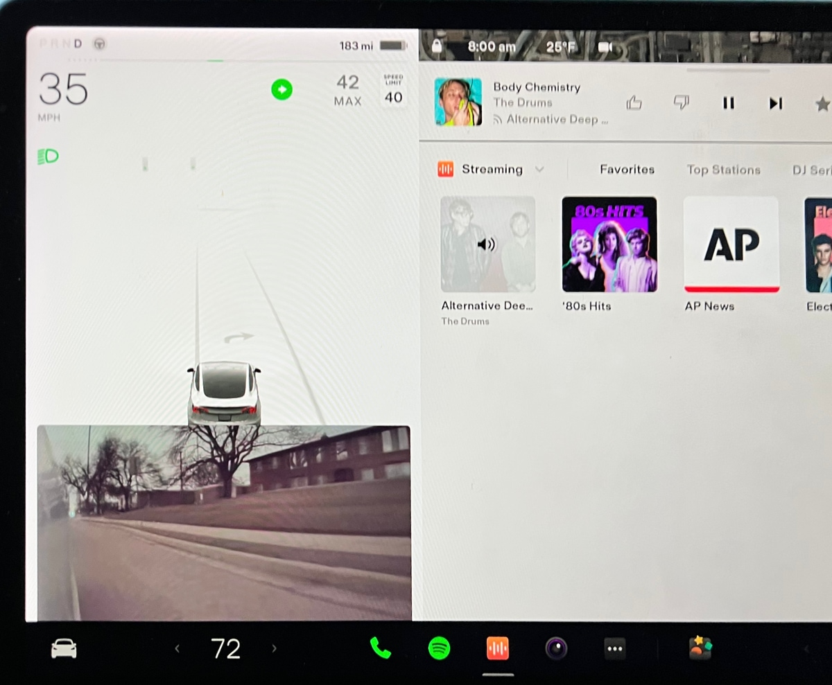
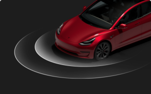
One of the features that is getting a lot of attention in this update is the new Blind Spot Camera feature.
It's an optional feature that will automatically show you the live camera view from your blind spot when you your turn signal is activated.
The car will automatically show you the left or right fender camera feed when the appropriate turn signal is used.
The camera feed will appear underneath the driving visualization, where the cards used to appear.
The camera feed will also automatically be dismissed when your turn signal is turned off.
HVAC Quick Controls
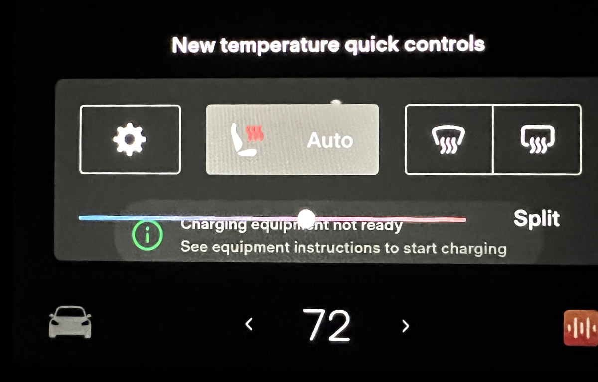
There is a new quick controls menu that appears when you change the cabin temperature.
Previously, when you adjusted the cabin temperature, you would get a slider to adjust the temperature and a button to enable Split mode.
However, now there are some additional options in this menu. Apps that were removed from the app launcher such as HVAC settings, seat heaters and front and rear defrost now appear in this quick menu.
If you want to get to the full HVAC settings, you can tap on the gear icon.
This will take getting a little used to as the full HVAC settins are now a swipe and tap away and feel more hidden.
Overall V11
Many owners have been looking forward to v11 to match what the Model S offers today.
Although not all the features that the Model S offers are here, the visual refresh is a welcome one. Some elements of the Model S such as window docking, the music mini-player are not available in this release.
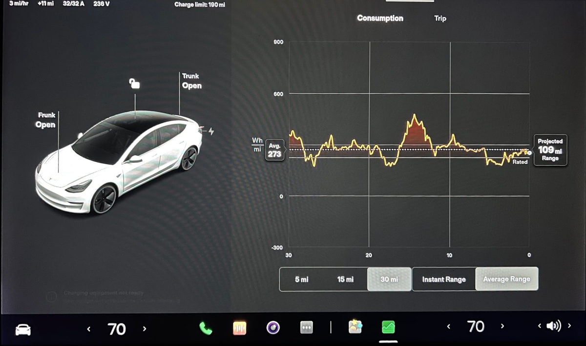
The existing apps in the Model 3 remain unchanged. For example, the music player still looks and functions the same as it did before and it can only appear on the right side of the screen.
Tesla has added many features over the years. Three years ago when the Model 3 was introduced, Sentry Mode, Dashcam, Dashcam Viewer, Tesla Theater and so many other features didn't exist.
Adding these features to the UI started making it crowded in certain areas.
Tesla took this as an opportunity to reorganize and declutter some of the UI so that it remained clean and intuitive
Some of the new buttons may take some getting used to, but it's exciting to officially see v11 running on a Model 3.






![Tesla Autonomously Delivers Its First Vehicle to Customer — And It’s More Impressive Than Expected [VIDEO]](https://www.notateslaapp.com/img/containers/article_images/model-y-2025/newmodely_77.jpg/382e0312c769d0bb2e1234f7ac556fad/newmodely_77.jpg)
